
Cliente: anywere
Project: Diseño logo
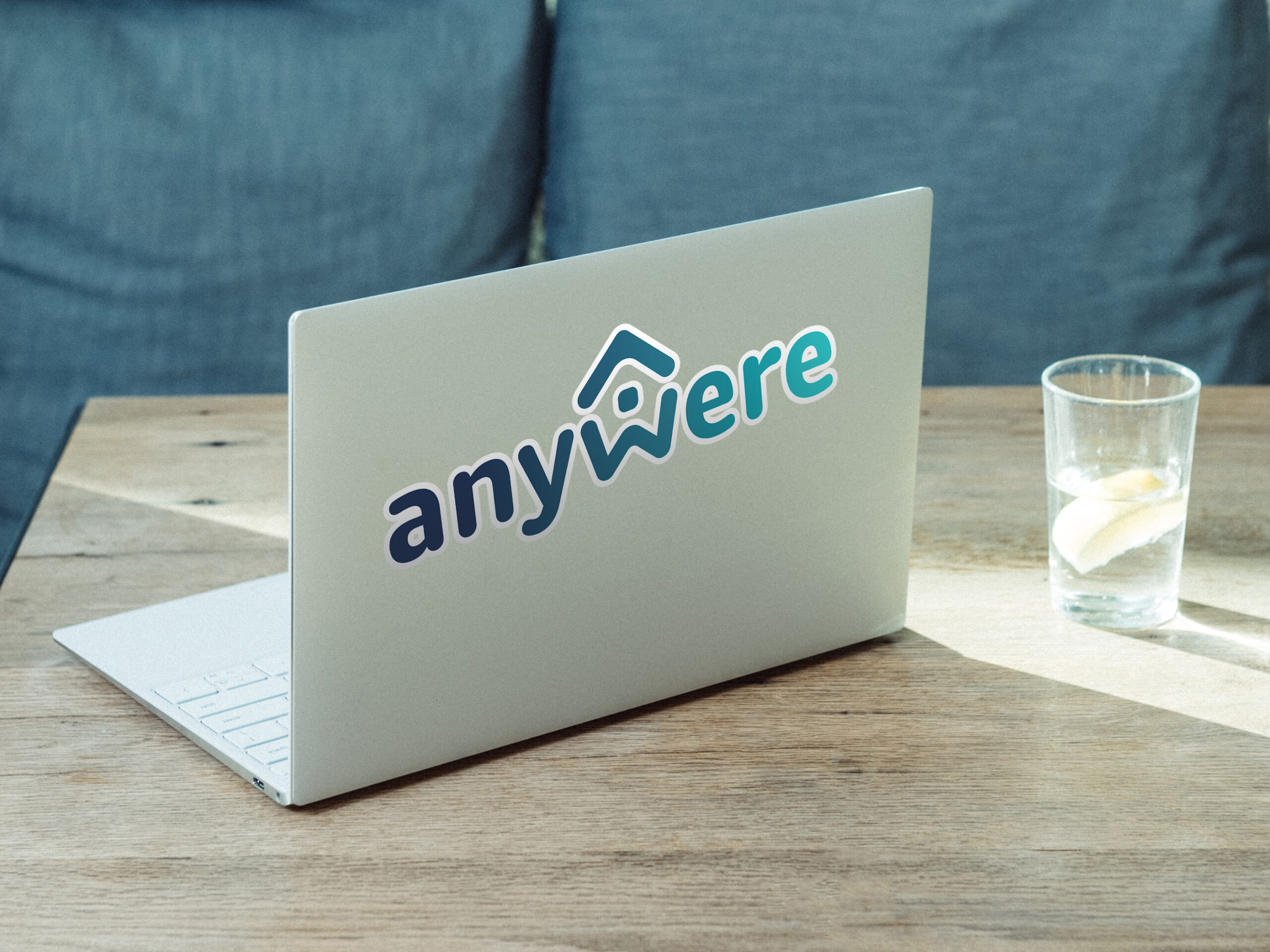
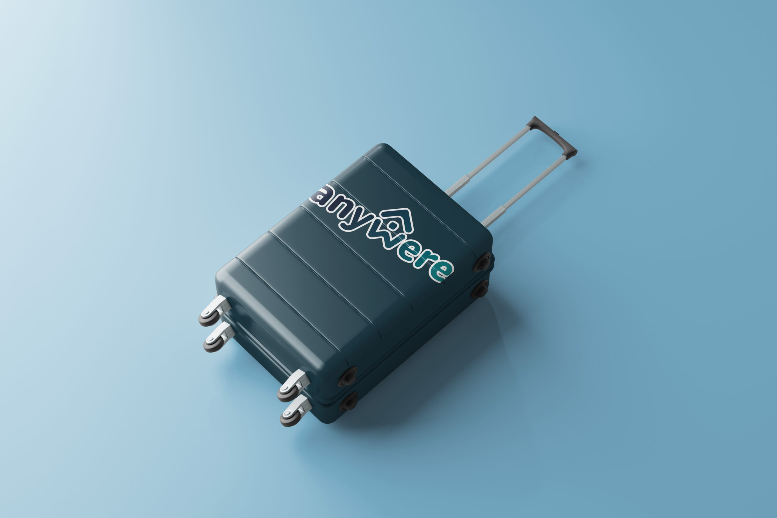
El logo de Anywere captura la esencia de la marca: fluidez, libertad y conexión emocional. El logotipo es moderno y elegante, con formas suavizadas y una sutil ligadura entre la “y” y la “w” que simboliza el movimiento continuo.
Su paleta de colores neutros y terrosos ancla la marca emocionalmente. Un icono versátil, que combina una brújula con un hogar, refuerza la dualidad entre el viaje y el sentido de pertenencia.
El logo es una invitación visual a vivir sin límites, a pertenecer en cualquier lugar, a ser Anywere.
That’s all folks.
Let’s work together.
Please email
© 2024 FERNANDO COLLANTES. ALL RIGHTS RESERVED | FERNANDOCOLLANTES.COM